A project for my UI/UX class.
Our assignment was to take an existing product page, evaluate its usability, and create a redesigned version that improves visual hierarchy, layout, and interaction design.
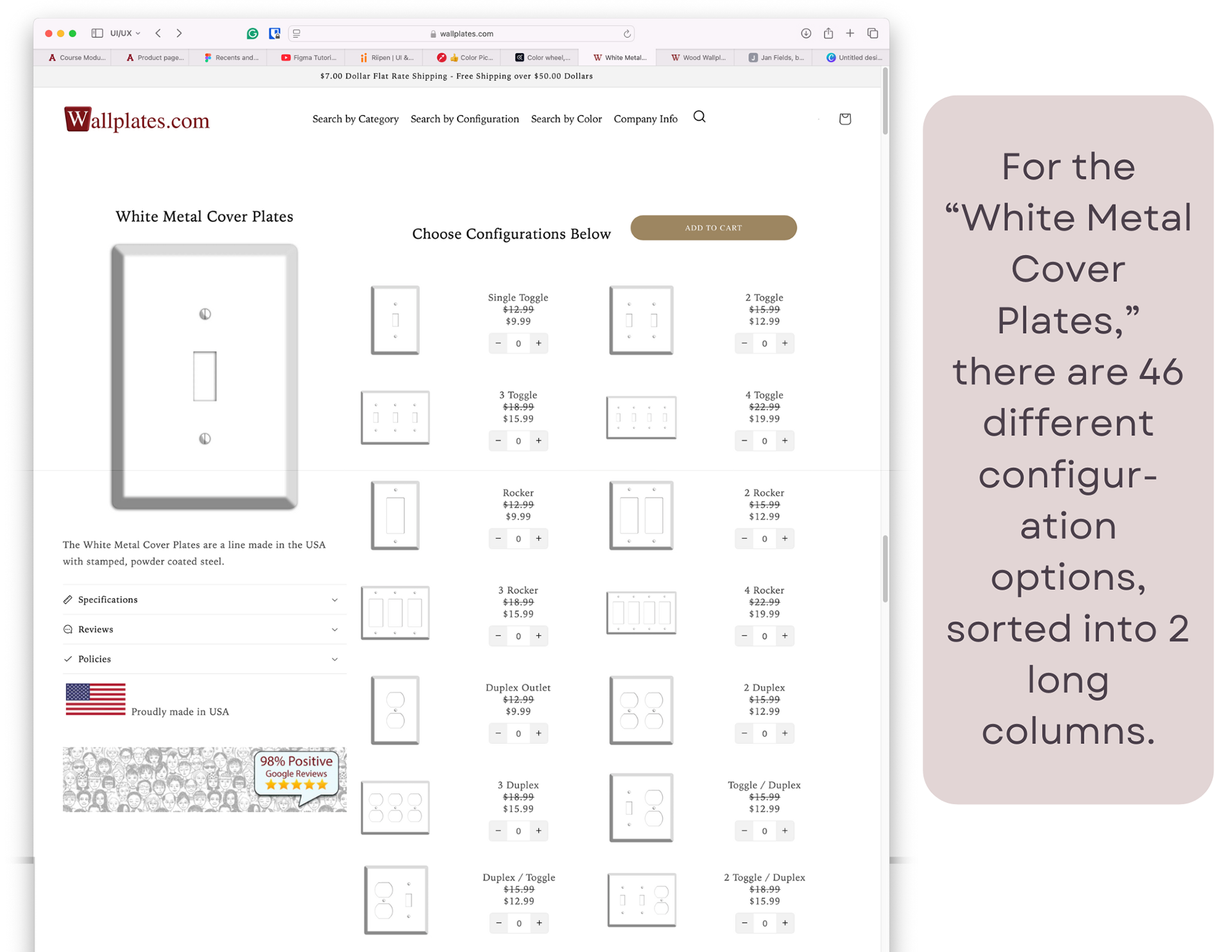
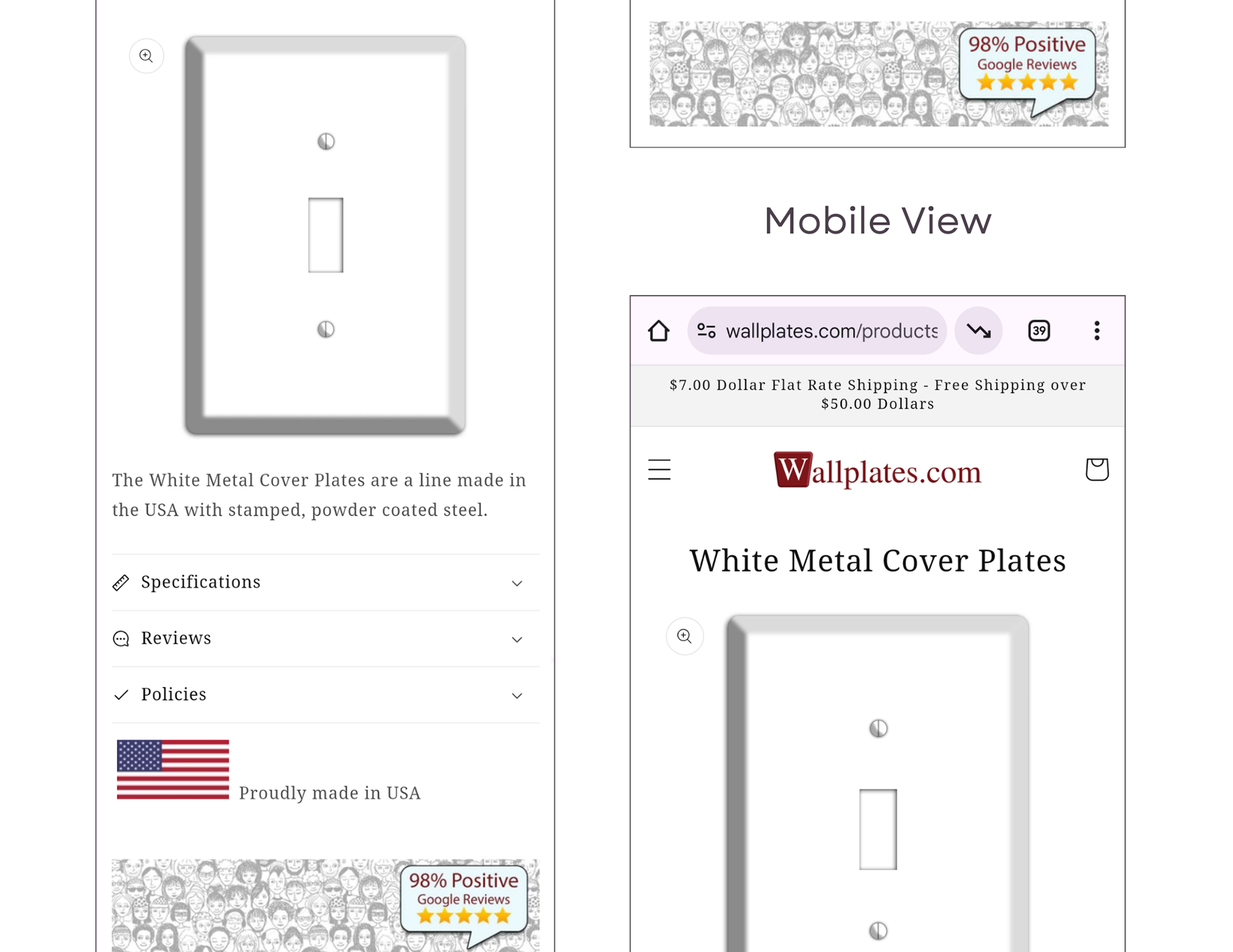
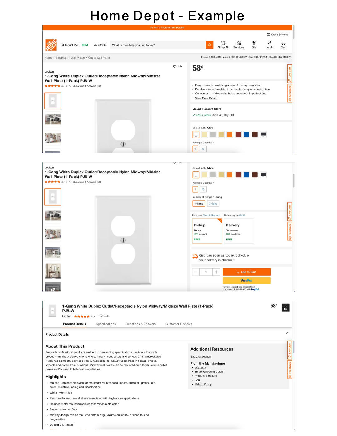
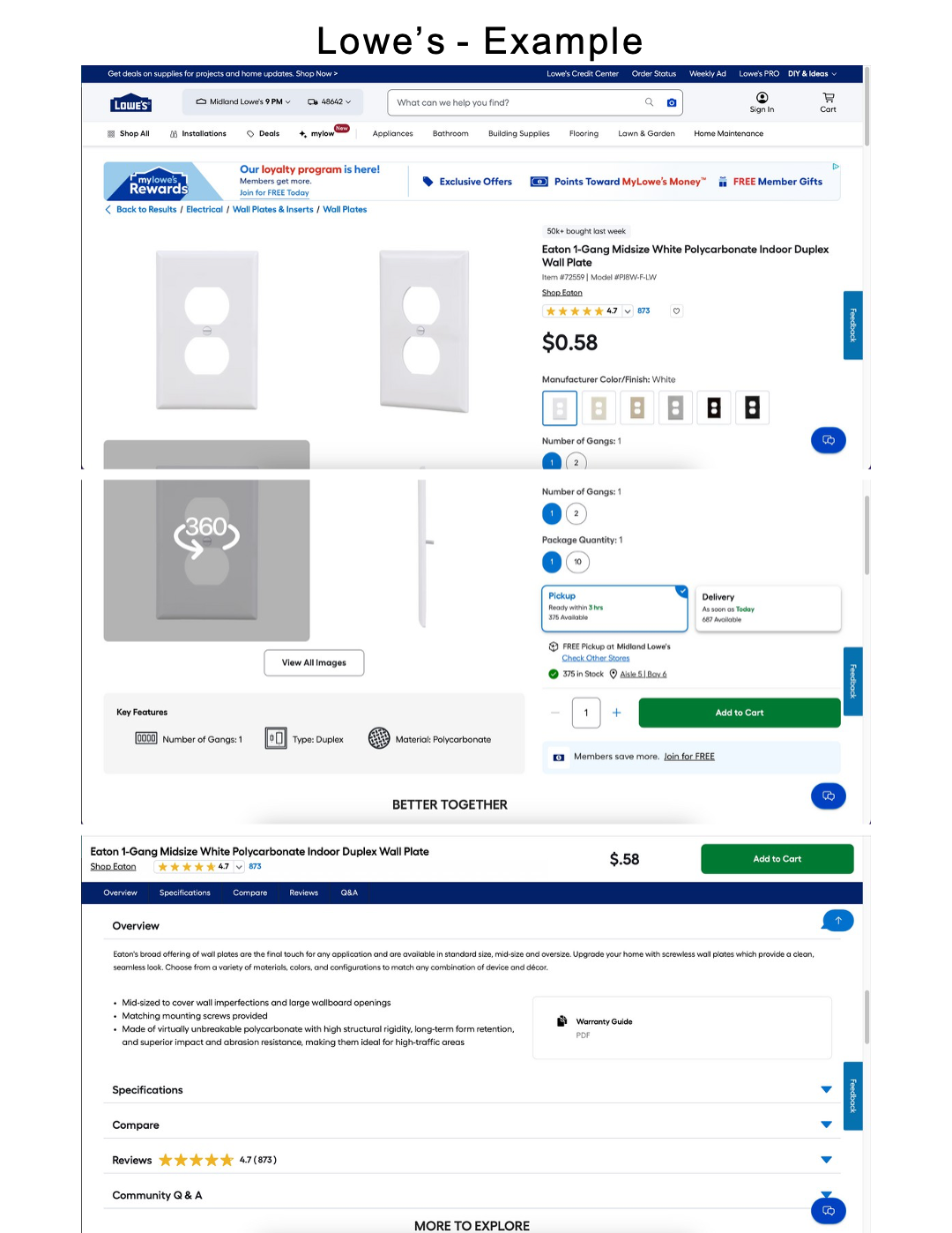
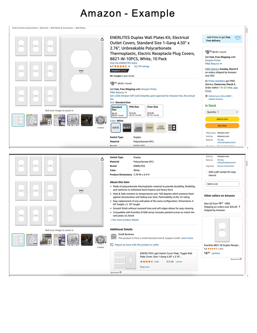
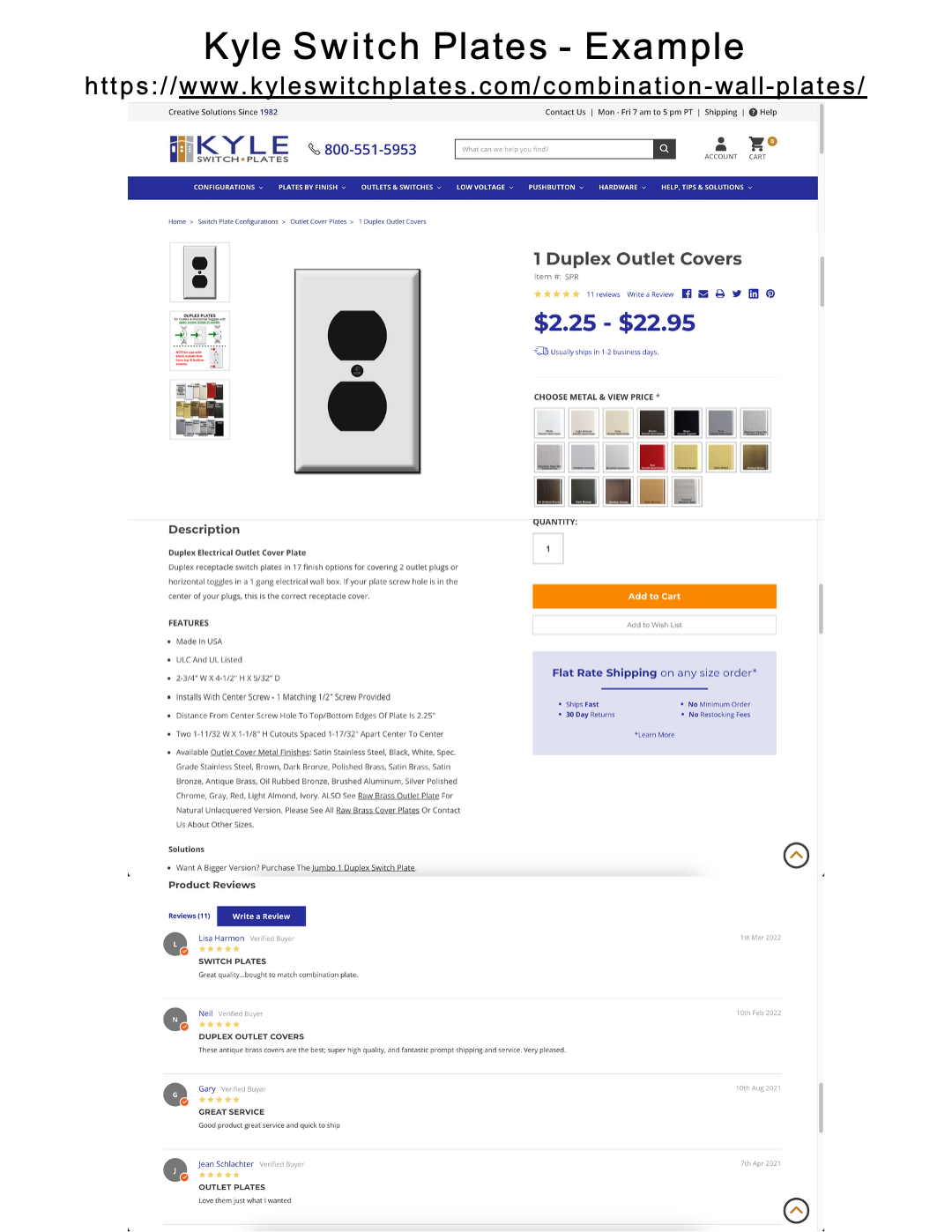
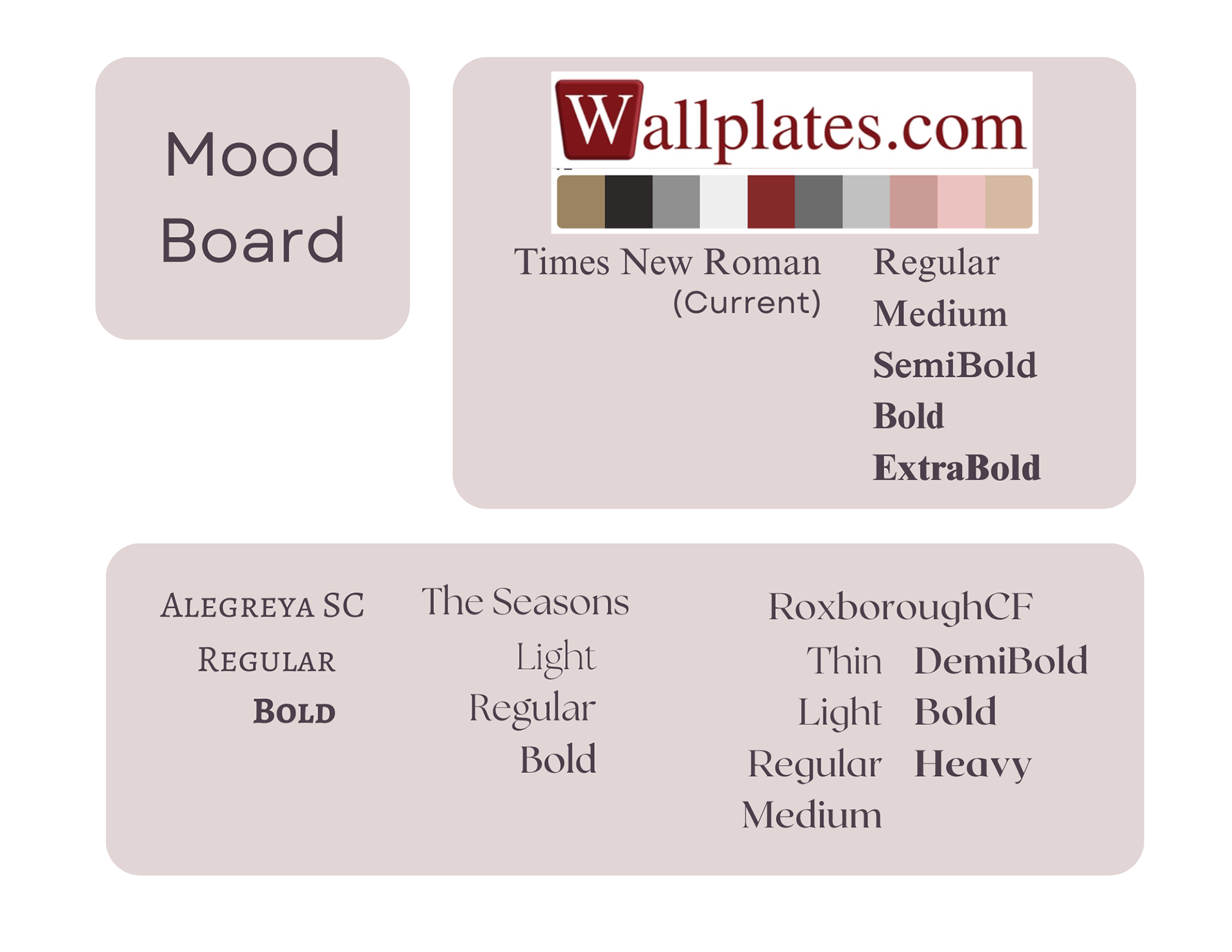
For my product page redesign, I chose to look at the page for 'White Metal Cover Plates' on Wallplates.com
Design Rationale
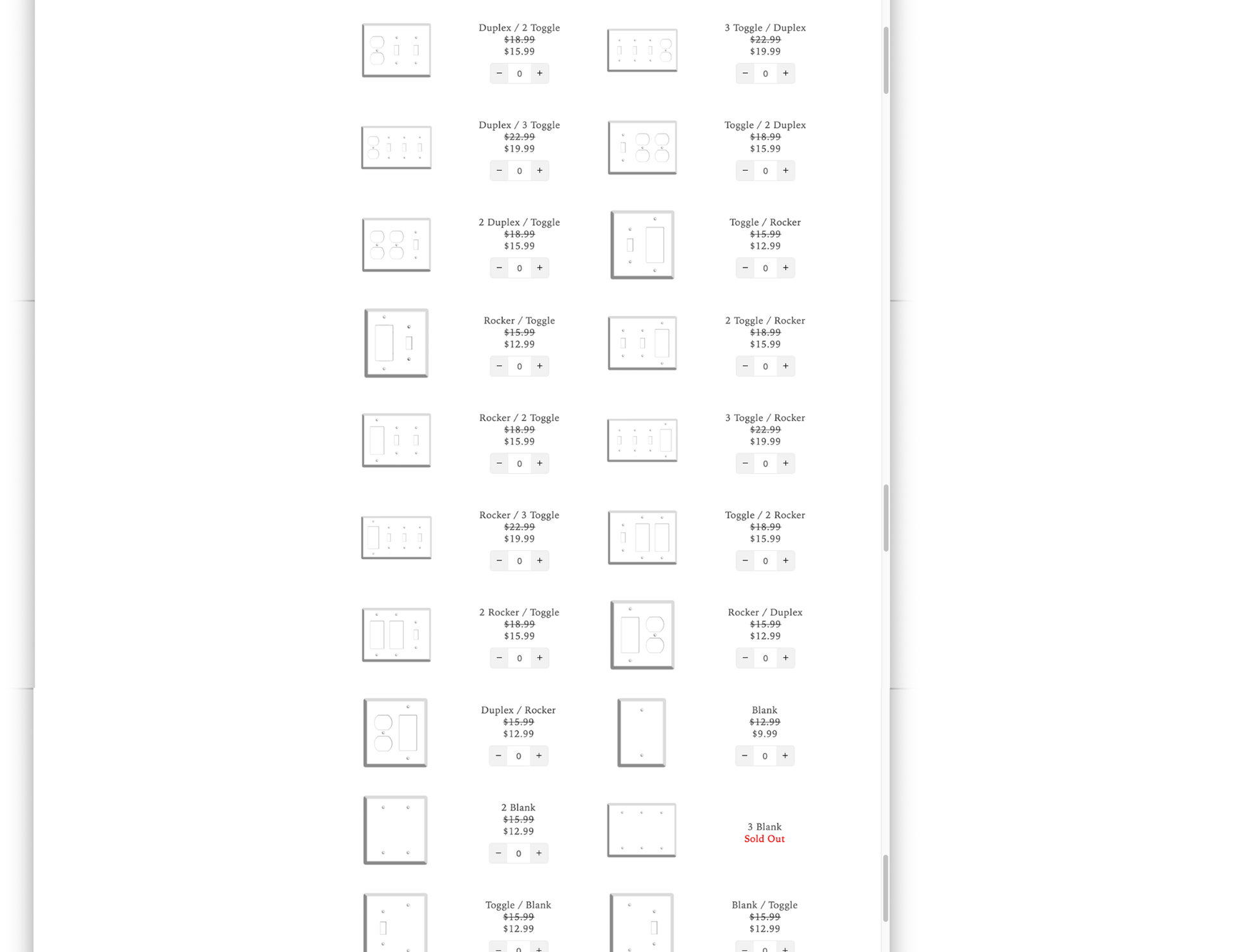
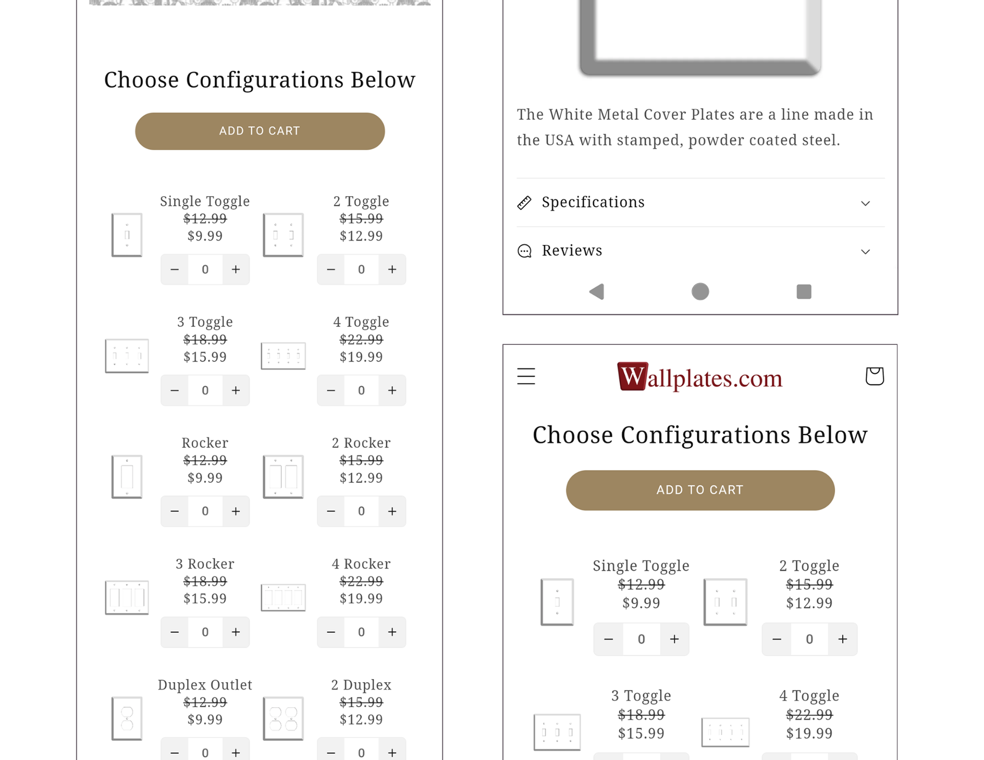
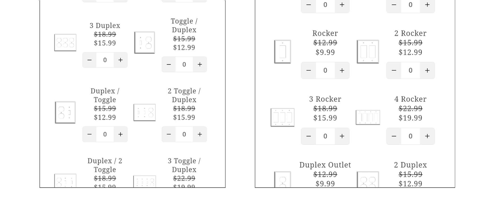
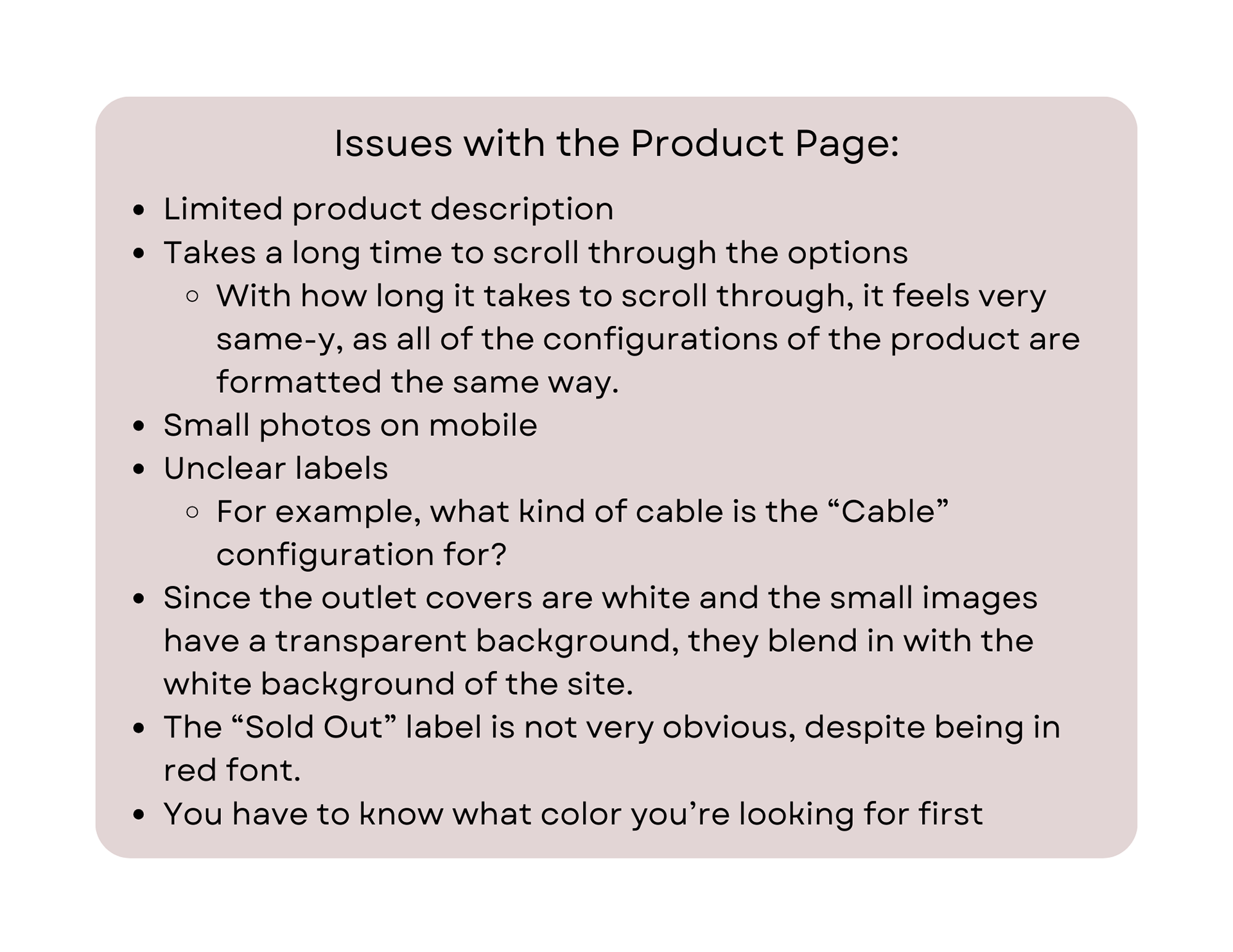
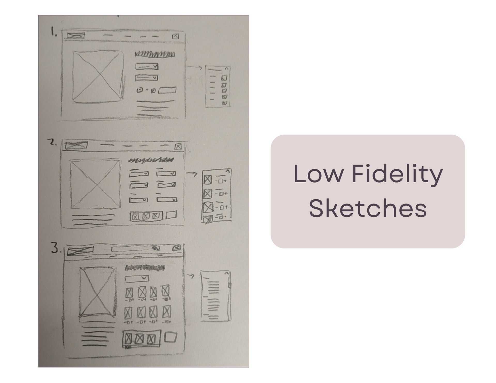
Overall, with this product page redesign, I hoped to make the page easier to navigate. Even though the page has a lot of issues, I chose to specifically tackle the problem of how all 46 different outlet cover configurations are laid out. It takes a long time and is tedious for the site's potential customers.
To do this, I decided to create a dropdown menu for users to select options by number of gangs, or openings, and sort even further by type of gang. This way, users can more quickly find the style of outlet cover they are looking for. And to allow the selected styles to be more visible, I created a "Selection" box which shows what has been added before they are added to cart for purchase.
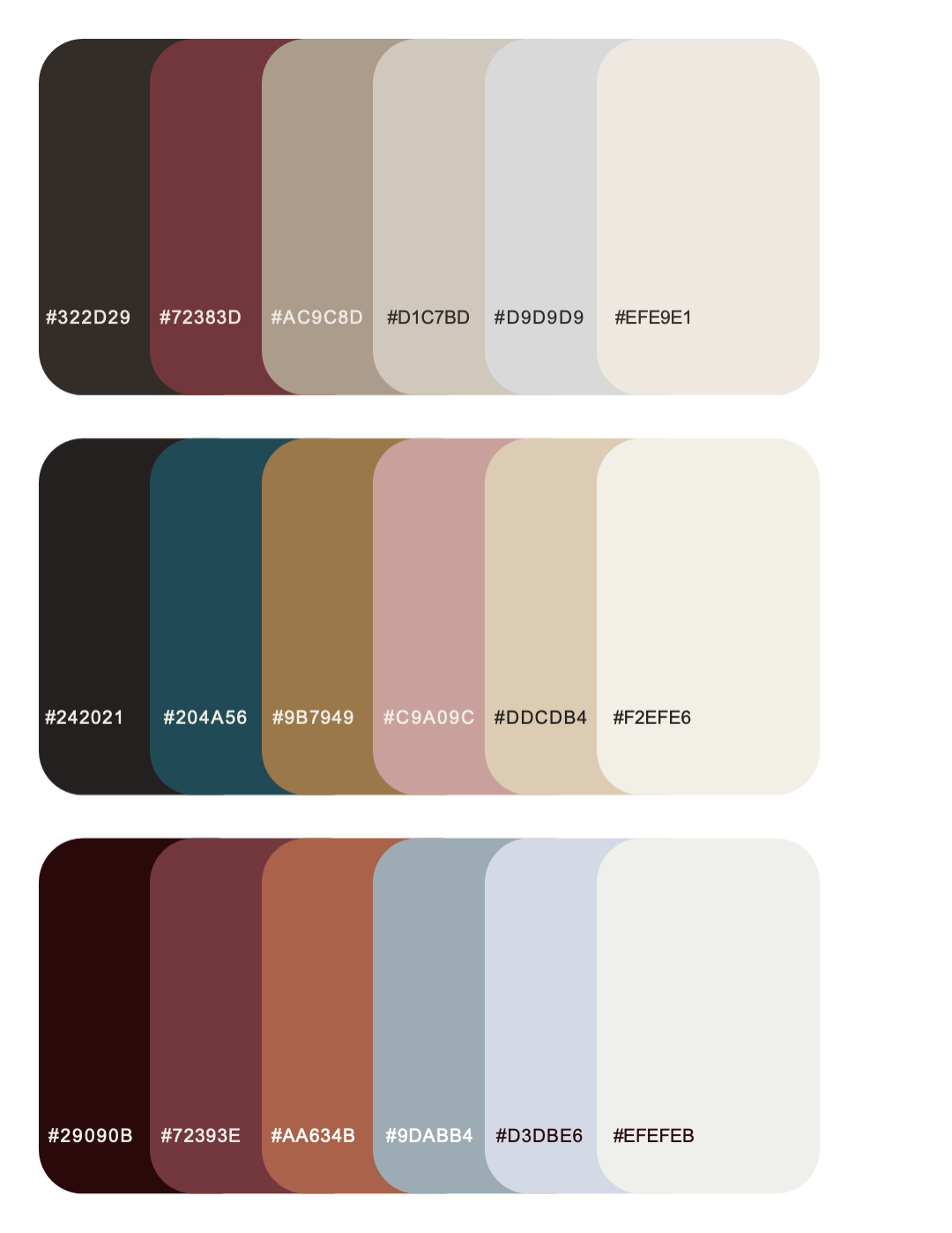
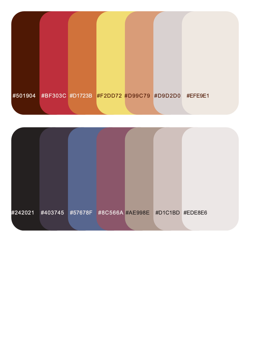
The outlet covers sold by Wallplates.com are significantly more expensive than those of competitors, which implies a sense of luxury. This prompted my choice in color and type, using a jewel-toned inspired color palette and serif font.